(Been monitoring this thread for a while but I guess I'm obliged to post now

)
First things first, it's looking good already. I especially dig the color palette used! I do have a few ideas what to improve about it which I'm going to write down now. It'll feel like there is more that I hate than I like but I'm just refusing to put up too many positive aspects

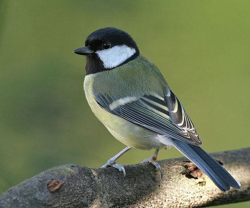
I feel like its wings are a little too low. Imagine the legs coming out of the hips, then the wings would be just slightly above it, making the upper body appear unreasonably tall. Also, as Marko said, the leg-lengths are different which might be something worth to fix as well.
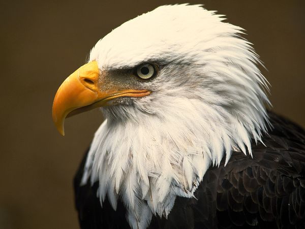
Something which I personally am not too fond of (this is purely subjective, disagreeing is definitely on the table) is the head-beak-transition. Usually, the beak is a little smaller than the head (you can check, the ordinary bird has something like a forehead.
Implying a bit of forehead would help defining the head, in my opinion.
Out of curiosity, is it a cover-illustration or inside the mag? I really want to know

 .
. .
.
 Chat
Chat


![[Image: 10500533_804673942913758_172681524024625...c48a719f01]](https://fbcdn-sphotos-f-a.akamaihd.net/hphotos-ak-xfp1/v/t1.0-9/10500533_804673942913758_1726815240246250412_n.jpg?oh=b7b92470c0c3b17e07f48e11b9a3d7ba&oe=55657979&__gda__=1429435888_cbd6c0f4852311dce11040c48a719f01)


 )
)


![[Image: Zs537rT.jpg]](http://i.imgur.com/Zs537rT.jpg)
![[Image: 212638695c8be4785852b3c25ee75e4959e61ae2.jpg]](http://img9.uploadhouse.com/fileuploads/21263/212638695c8be4785852b3c25ee75e4959e61ae2.jpg)


 :-
:-